Thursday, 24 March 2011
Monday, 21 March 2011
RESEARCH PART B - chair 3
The design is made primarily out of sheet metal with some components made of plastic for support purposes (either grip or framework). The design is welded together and powder coated (available in various colours).The design has the ability to be stacked and features some sheet metal folds and laser cut outs for aesthetics. As the design is welded, packaging and transportation would be quite poor due to the weight and dimension issues. The only advantage in packaging relevance is the stacking feature.
RESEARCH PART B - chair 2

The cafe chair provides a more natural feel to the atmosphere and relies on wooden restraints to hold the components together. The chair due to the numerous components and thickness of the components would prove to heavy and wouldn't stack that well. The design would be packaged and delivered in the same conditioned as it is displayed in the pictures and would not need any additional assembly however that would impact heavily on delivery costs. Also it means it is not designed to be disassembled which means ultimately nothing can be replaced unless going to a specialist.
RESEARCH PART B - chair 1

This cafe chair is constructed by a collaboration of materials and finishes. The design relies on screws for the metal framework. The framework and screws provide a flat bottom which helps the stacking process. Furthermore The design has a embracing organic form which features a hole in the back to eliminate unnecessary material. The design would be transported as two parts (the assembled metal frame and the assembled chair body) with a additional pocket of screws.
Saturday, 19 March 2011
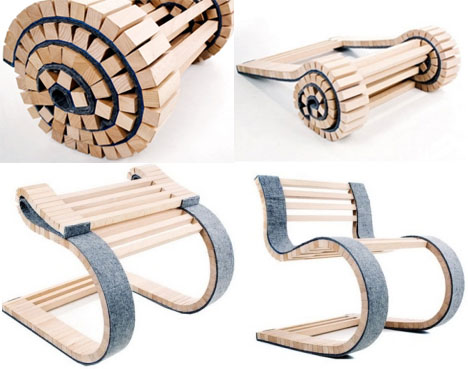
Designed by Uros Vitas

Transforming furniture is fairly amazing universally, but dynamic roll-out cantilever chairs are in a class of their own. This design by Uros Vitas is the best of all worlds: easy and inexpensive materials, repetitive forms, portability and functionality.

A band connects the various wooden pieces so the entire chair can roll back into a highly mobile unit akin to a sleeping bag or tent – perfect for camping or other outdoor uses.
The unfolded form seems to balance impossibly but the segments reinforce one another and the flexibility translates into comfort for the person seated in the final configuration – a highly mass-producable and brilliant blend of form and function.
Page URL
http://dornob.com/this-is-how-we-roll-out-a-radically-unique-chair-design/
Page URL
http://dornob.com/this-is-how-we-roll-out-a-radically-unique-chair-design/
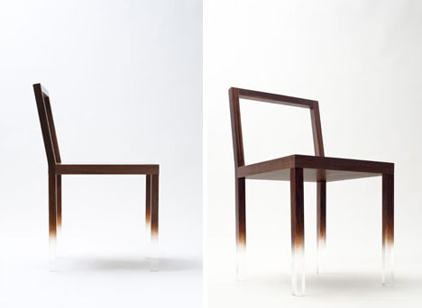
Designed by Nendo
Invisible Chair! Disappearing Designs & Hidden Structures

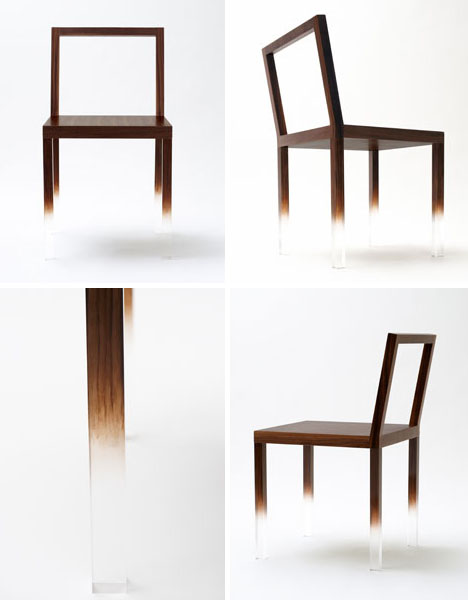
At first it looks unbelievable – the heaviest and most solid part of a chair floating on nothing. Clear acrylic at the base of the legs fades slowly to wood-color paint toward the top of the structure, Â seat and back frame of this unique chair design.

Designed by Nendo, this is as much an artistic trick as it is a practical piece of home furniture. After all, while the initial experience is quite impressive the trick quickly becomes old hat – but their strategies and tactics persist in other works.

Nonetheless, other works from Nendo prove equally amazing and likewise use illusion for more complex-yet-subtle pieces of everyday furniture. This chair, for example, looks far too thin to be completely wood – and it is. Yet by using rounded wooden elements with no seams it seems, it becomes hard to guess that there is a hidden metal frame inside of the narrow wood structure.
page url
Friday, 11 March 2011
Zentrum Paul Klee
Renzo Piano was commissioned to design Zentrum Paul Klee museum which as to showcase the collection of artist Paul Klee. Paul Klee was an artist who was inspired by the silence of nature but especially the silence of water. It was evident that Piano incorporated that inspiration into the overall design of the building with a iconic bold wave form on a gently sloping site which compliment each other well. The form is bold but not so striking that the $86 million building clouds the relationship of the site and the Alps in the background.
EXTERIOR SPACE
 The site is a slighting sloping green field featuring the Swiss alps in the background and a motorway. The design features a bold wave form which is made out of steel which is illuminated at night for aesthetic purposes and also to compliment the lights of the motorway. The design feater 3 waves which create three main interior spaces (main hall, exhibition hall and library) and features a combination of skylights and glazed glass panes to circulate sunlight but also to achieve a flowing vibrancy to the facade. The design is to house artwork which is light sensitive. Therefore for this situation Piano decide to incorporate a green roof area which branches from the landscape. This allows not light to enter the room but also provide a great aesthetic and environmental benefits. The external space due to the inconsistency of the height and width, a ever changing experience is achieved to the space .
INTERIOR SPACE
 The Interior space is naturally light during the day with the facade being heavily glazed with glass and skylights while the blinds on the external facade allows light control when necessary. The rooms incorporate a clean environmental colour scheme by using primarily white or light colours in combination of lush green grass surrounding the exterior but shown through the glazed glass panes, incorporating the landscape.
 MATERIALS
- Steel
- Glazed glass
- Concrete
Thursday, 10 March 2011
TWA Terminal Building - New York
The TWA Terminal building in New York was designed by Eero Saarinen and completed in 1962. The Detroit based design firm were commissioned to design the building in 1956 with the client requesting that the design capture the 'spirit of flight.' Saarinen incorporated the shape of a large birds wing span whilst in flight which emphasized the exterior of flight itself (as a technical motion). The interior emphasized the spirit of flight and how it feel which created a surreal futuristic interior space during the time of construction. Today, the terminal has be marked as a historical landmark and serves multiple purposes including a exhibition space for artists.
EXTERIOR SPACE
 The exterior focus on the form of a gull wing shape which emotes speed and also flight. It provides a streamline effect which at night would be quite illuminating. Whilst it is streamlined and emoting speed, with the organic form created by reinforced concrete with a interior steel web for its framework, it invites the user into the space.
INTERIOR SPACE
The interior space is a contemporary cool theme which emotes the feeling of wind which would be experienced in flight. The design through it's expressive curves of the exterior form creates spacious halls with the overall theme of sculpture in the concrete making the interior inviting whilst futuristic for the time. The large panes of glass were glazed with a purple tint to keep with the contemporary cool color scheme and also adds to the aesthetic appeal of the design.
MATERIALS
- Steel Framework to reinforce concrete
- Reinforced Concrete with white dye
- Glass glazed with purple tint
Vitra Fire Station
 |
| Annotated Research Board |
INTERNAL SPACE
 Zaha Hadid architects designed the building with the concept of angles and the combination of polygons and triangles. The relatively small structure is long but narrow, so internal space relies on a range of techniques to increase the sense of space in the building. Glass wall sections and transparency which results in a greater visual space. The interior space uses a more monochrome theme with the use of polished aluminium planes to create a combination of matte and gloss textures with the reinforced concrete.
EXTERNAL SPACE
The design with it's sharp edges formed by the reinforced creates a wall of the exterior space due to it's length and style. The furniture in the exterior is also made of concrete and uses angles and polygons to create its overall form. The design overall is geometric, playing with angles and transparency to create a greater visual space and natural lighting. The exterior is also impacted by this transparency as the structure being narrow, the viewer will be seeing the small space of the interior due to the location of the windows. This therefore shrouds the realization that the building is narrow, which then makes the external space feel larger.
MATERIALS AND FINISHES
-Reinforced concrete with a white dye creating a matte finish
- Glass
- Polished aluminium planes which create a gloss finish
overall, a monochrome scheme with the inclusion of colour for focal points was used for the internal space.
WATCH VIDEO FOR CONCEPT GENERATION OF THE VITRA FIRE STATION
http://vimeo.com/12555949
Friday, 4 March 2011
Marcel Breuer - Long Chair
Designed by Marcel Breuer
Manufactured by Isokon
Marcel Breuer is a Hungarian designer who like other great designers studied and taught at the Bauhaus with expertises in Architecture, furniture and industrial productions. As many of the great designers of the Bauhaus, he amongst others left during the second World War to escape the Nazi regime. Breuer relocated to London
 Breuer in his early career was influenced by tubular steel which lead to the iconic 'Wassily chair' which uses a tubular steel frame and fabric (leather) that wrapped around the frame to form the support for the human body. In his late career however, he was influenced by bent and formed plywood in his furniture design career. The Long chair was design in his later part of his career and produced by Isokon (
 The primary feature of the design is the plywood frame which is bent into a series of curves to form a structurally strong and also aesthetically pleasing design. The frame expresses comfort and ease which invited the user due to the curvature of the frame and the woollen seat. Plywood is a natural wood which can be bent and also laminated and moulded which was revolutionary in design during pre-war modernism. The process of making the frame was to create a veneer out of the plywood and force this through a steel band mould which is attached to a pressure hose which allows the plywood to bend. Then the plywood is set to cool down and glued to dry which creates this organic frame of the 'long chair.'
Thursday, 3 March 2011
Subscribe to:
Comments (Atom)


